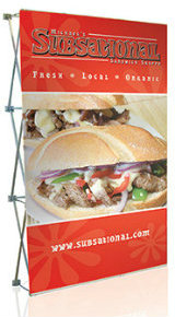
When designing a sign for your business, it has to portray it in the best possible way. The main purpose of the sign is to increase the public’s awareness about your business, or to announce a new service or product. So, there are a few things you need to take into account before printing the material and especially avoid a few mistakes.
In many cases, business owners go for traditional designs, with straight proportions, color balance and a bit old-fashion drawing. But this is not always effective. In fact, this kind of boring sign will just blend in the background and turn invisible. The best way to stand out is to be unique and unpredictable, so you should avoid these pitfalls:

- Blending into the surrounding environment. You want to be seen, right? Blending in will just achieve the opposite.
- Including too much information. Clutter is one of the first things that deter people from further examining your sign and your offer. Just include one or two lines that shortly describe your offer, and add a QR code that leads to a special offer.
- Trying to be elegant. If you want to stand out and attract attention, you need to be bold and use unusual design or font, bold colors and an eye-catching message that may be funny or short and intriguing (like a movie teaser).
- Placing the sign too high. If the sign is placed too high for people passing by to read it or even notice it, well that’s just against the entire purpose, isn’t it?
- Cutting back on the budget. This might be the worst mistake – never scrimp on a quality, durable sign. No one likes to see a ripped or faded sign that looks like it’s been hanged there for ages. It won’t attract anyone.
Now that you have this information, use it wisely and make sure your next sign is unique and attractive.
