We live in a world of options, and in many cases, too many choices can actually make consumers confused and not choose anything. This is why making your product stand out and become the preferred choice is quite critical. When it comes to choosing a certain product over another, the packaging is an important factor, maybe even the most important.
Product packaging basically appeals to the human senses, meant to evoke memories and feelings that consumers unconsciously link to the product. A good package will be so desirable that it would be impossible for customers not to buy it. The main trick is to understand the psychology behind it and use it to your advantage.
Understanding color

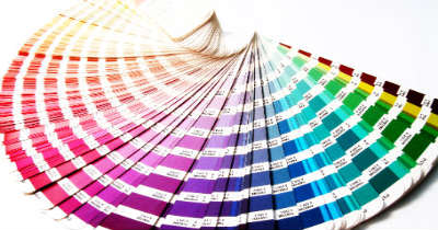
Different colors have different meanings and cultural signals, and they can affect the way we perceive products. There is an entire psychology behind color meanings, for instance: Green signals nature, profit, growth and safety, Blue signals confidence, trust and knowledge, Red signals vigor, energy and passion, and Purple signals stability, royalty and glamor.
When you think about it, colors can even turn iconic over time, like Red in Coca-Cola, Lego, Target and Pinterest, Blue in Facebook, Ford, IBM and Intel, Green in Starbucks, Tic-Tac, The Green Giant, Ricola and Knor, and Yellow in Best Buy, Yellow Pages, Shell and McDonald’s.
Understanding package size and shape
It is well known that smaller packages are more attractive. Maybe it’s because people perceive large product size as less expensive for the company to produce. Industrial companies make mass products, whereas handcrafted products are unique, and there is a lot of work involved in making them.
The shape is another critical factor, because the more unusual it is, the better the chance of it being more memorable. Unique shapes catches the customer’s eyes and get planted in their brain. There are many examples for how the shape can make all the difference: Toblerone chocolate shaped as a triangle, Pringles chips that come in a can, or Mr. Clean cleaning detergent in a Dumbbell packaging.
Understanding placement
Although having a unique, colorful package is important, it’s not enough. You should also consider the placement of the product inside the store. Supermarkets plan exactly where to place each product, so it’ll get maximum exposure. For example, kids’ cereal boxes are usually placed at lower shelves where they can reach them and see the character’s eyes, and adult cereals are placed at higher shelves.

Also, if you’ll think about it, you would probably remember that basic needs products such as bread, milk or eggs are usually located at the back. Why? Because it gives other, less important products the chance to captivate your attention on the way to those further aisles.
The bottom line is, even if you’re not planning a drastic change, try adding a new color in your logo and insert it to your brochure marketing campaign. If you receive positive feedback, you can gradually insert it to your product packages and even think about a new package that will be unique and attractive.
